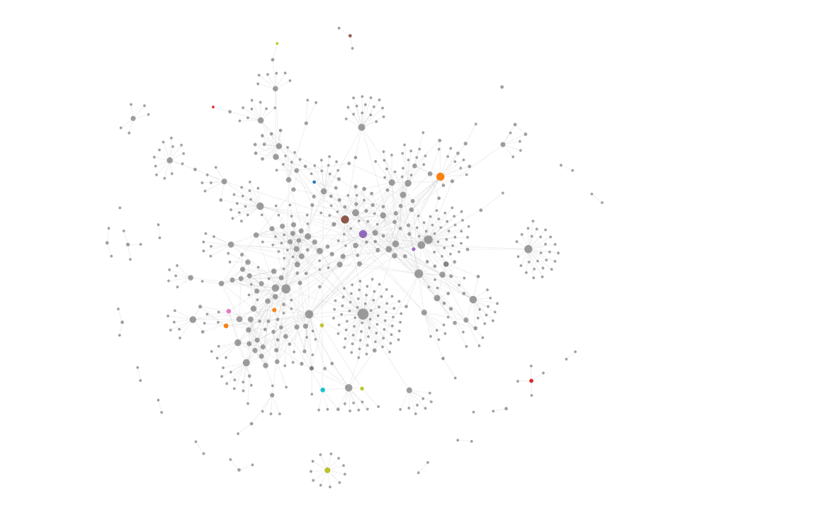
My Logseq graph’s… graph.
Rewarding digital brainery
Since january, I’ve been using Logseq to take notes. I’ve talked about this a bit more in other posts, but I had never really payed attention to the graph visualization of my notes because I generally haven’t found it that useful. Until recently, Logseq has been really great, but I’ve mostly used it because search is convenient and I like the UI. I hadn’t really taken advantage of the linked-ness, despite writing notes with links. This is largely because my graph hadn’t yet reached the critical mass at which links start to become really useful.
Since starting college though, the amount of knowledge in my graph has increased a lot, and links between concepts covered in different courses and previous knowledge have begun to emerge naturally. It feels like all of my note-taking and work has paid off, and I’m now even more motivated to get information into my notes.
I’m making it sound like it’s been a ton of work to populate my graph, but it hasn’t actually been that much work. Two things which are relatively low effort have been responsible for the lions share of the content in my graph:
- Reading notes (see Getting Kindle notes into Logseq and My current Logseq+Omnivore workflow). I already take notes when I read as I find it a low effort way to help me process what I’m reading. Since I read a lot of ebooks and online articles, getting those notes in is relatively easy. With physical books, I try to type up my notes that I take in the margins or on sticky notes, but this doesn’t always happen. For PDFs (mostly assigned readings), I use Highlights on my iPad, and export my notes as markdown to logseq.
- Journaling. I use Logseq’s journal pages to keep track of my schedule, take general notes, and to think things out. Through this, a lot of not fully matured ideas and bits of thought end up in my graph, which gives them space to exist, and possibly mature through connections occurring over time. This idea is central to the organization of this blog.
Logseq is really cool, but I wish it was more beginner friendly. I think it makes a lot of sense to people with computer backgrounds, but little sense to anyone else, which is apparent in its userbase. Obsidian seems to be a far more legible and understandable option, but I found that a block based workflow was a lot more flexible and useful to me.